
Banner na glowna en
b.jpg)
Reserve a stand
Exhibitors 2024:
Exhibitors 2024:


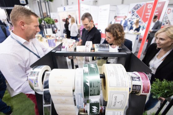
Packaging Innovations International Packaging Trade Fair is an event with an established position on the market, visited every year by thousands of guests from Poland and abroad. During two days, you will be able to check the exhibitors' offers and take part in substantive presentations prepared by industry experts. As previous fair participants say, it is a place combining business and education, focusing on the quality and diversity of the range of presented products and solutions.
![_ILE3195.jpg [1.70 MB]](https://packaginginnovations.pl/storage/image/core_files/2023/9/21/57000f5d85e8ed2fb7e3c5d3adbed3da/jpg/twk/preview/_ILE3195.jpg)
![_ILE2968.jpg [1.12 MB]](https://packaginginnovations.pl/storage/image/core_files/2023/9/21/154df1c27d1a838f73f1d8de06336e1e/jpg/twk/preview/_ILE2968.jpg)
![_ILE2935.jpg [1.41 MB]](https://packaginginnovations.pl/storage/image/core_files/2023/9/21/1afd571d3649af22f54647a5125c5f6f/jpg/twk/preview/_ILE2935.jpg)
Wide offer of exhibitors
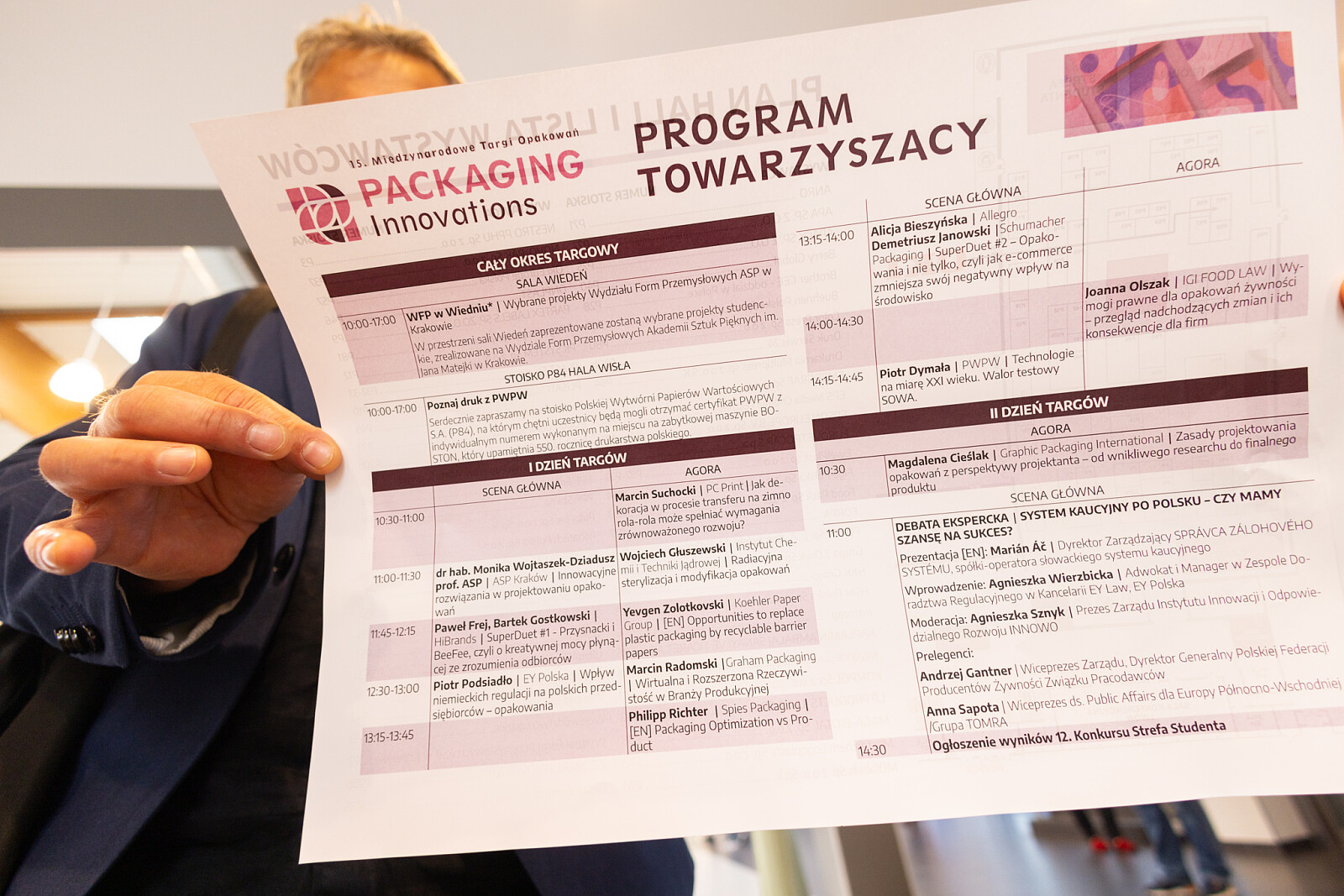
Several hours of presentations on two stages
Young designers contest
Hundreds of business cards listed
-

Exhibition offer
Check why you should become an exhibitor of Packaging Innovations 2024
-

Sponsorship
Become a sponsor of the Student Zone Contest recognized by the World Packaging Organization
-

Become a speaker
Share your knowledge with others by becoming a Packaging Innovations Trade Fair speaker
Thematic scope
-
Exhibitor profile
- packaging made of various materials,
- printing: print finishing, printing inks, labels,
- machines, printers, scanners, plotters,
- services: design, packaging testing, legal services, packaging recycling,
- software for production management and packaging and label design,
- materials needed for the production of packaging and labels,
- packaging fillers, pallet wraps, packaging closures,
- logistics, storage, packaging,
- advertising stands, displays, advertising bags,
- associations,
- publishing houses
-

Visitor profile
industries:
- cosmetics,
- food,
- beverages,
- advertising,
- chemical,
- clothing and footwear,
- pharmaceutical,
- logistic,
- automotive,
- other: zoological, construction, furniture, electronic
See what 2023 edition looked like!
Frequently Asked Questions
-
 11.04.2024
Visit European Packaging Symposium
-
 08.04.2024
Get a taste of Kraków! A new foodie’s guide to the city!
-
.png) 05.04.2024
05.04.2024Get your free ticket to the trade fair
-
 26.03.2024
5 reasons why you should become a speaker